
16. Overview — ವಿಶ್ಲೇಷಣಾ ಡ್ಯಾಶ್ಬೋರ್ಡ್
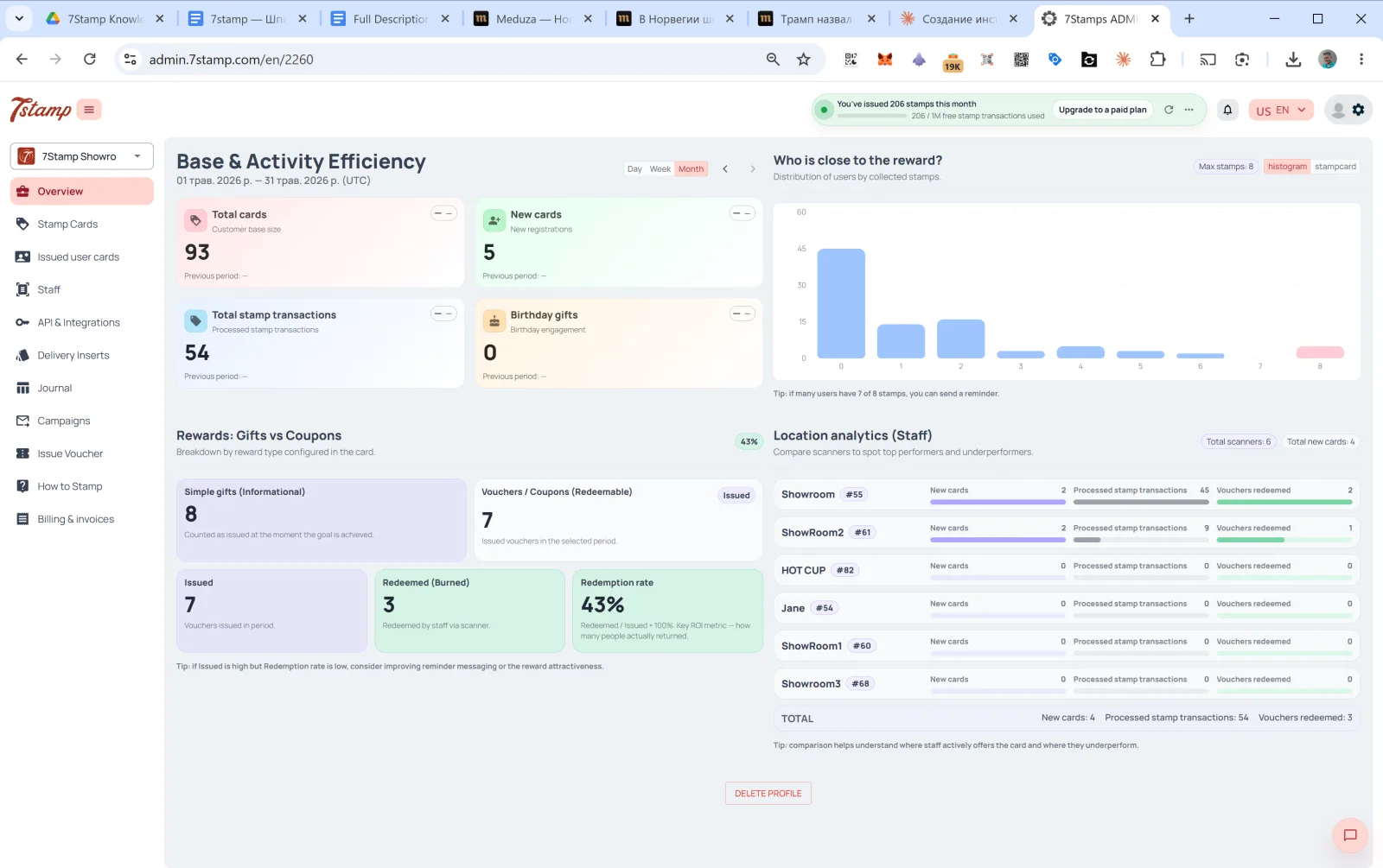
Overview ಆಡ್ಮಿನ್ನ ಮುಖ್ಯ ಪುಟ, ಲಾಗಿನ್ ಆದ ನಂತರ ನೀವು ಮೊದಲು ನೋಡುವುದು ಇದನ್ನೇ. ನಾಲ್ಕು ವಿಭಾಗಗಳ ಡ್ಯಾಶ್ಬೋರ್ಡ್.
16.1 Base & Activity Efficiency
ಆಯ್ಕೆಮಾಡಿದ ಅವಧಿಯ ಗ್ರಾಹಕ ನೆಲೆಯ ಚಟುವಟಿಕೆ. ಮೇಲಿನ ಬಲಭಾಗದಲ್ಲಿ ಬದಲಿಸಿ: Day / Week / Month (ಡೀಫಾಲ್ಟ್ Month), ಅವಧಿಗಳ ನಡುವೆ ಚಲಿಸಲು ← → ಬಾಣಗಳು.
ನಾಲ್ಕು ಕಾರ್ಡ್ಗಳು:
- Total cards — ಒಟ್ಟು ಗ್ರಾಹಕ ನೆಲೆ (ಗ್ರಾಹಕ ನೆಲೆಯ ಗಾತ್ರ).
- New cards — ಅವಧಿಯಲ್ಲಿನ ಹೊಸ ನೋಂದಣಿಗಳು.
- Total stamp transactions — ಪ್ರಕ್ರಿಯೆಗೊಂಡ ಸ್ಟ್ಯಾಂಪ್ ವಹಿವಾಟುಗಳು.
- Birthday gifts — ಹುಟ್ಟುಹಬ್ಬದ ತೊಡಗಿಸಿಕೊಳ್ಳುವಿಕೆ (ನೀಡಲಾದ ಹುಟ್ಟುಹಬ್ಬದ ಉಡುಗೊರೆಗಳು).
ಪ್ರತಿ ಕಾರ್ಡ್ನಲ್ಲೂ ಹಿಂದಿನ ಅವಧಿಯೊಂದಿಗೆ ಹೋಲಿಕೆ ಇರುತ್ತದೆ (ಡೇಟಾ ಇಲ್ಲದಿದ್ದರೆ Previous period: —).
16.2 ಬಹುಮಾನಕ್ಕೆ ಯಾರು ಹತ್ತಿರದಲ್ಲಿದ್ದಾರೆ?
ಸಂಗ್ರಹಿಸಿದ ಸ್ಟ್ಯಾಂಪ್ಗಳ ಪ್ರಕಾರ ಗ್ರಾಹಕರ ಹಂಚಿಕೆಯ ಹಿಸ್ಟೋಗ್ರಾಮ್. X ಅಕ್ಷ ಸ್ಟ್ಯಾಂಪ್ಗಳ ಸಂಖ್ಯೆ (0, 1, 2, …, Max), Y ಅಕ್ಷ ಆ ಮಟ್ಟದಲ್ಲಿರುವ ಗ್ರಾಹಕರ ಸಂಖ್ಯೆ.
ಕೆಳಗಿನ ಸೂಚನೆ: “if many users have 7 of 8 stamps, you can send a reminder.” (ಅನೇಕ ಬಳಕೆದಾರರ ಬಳಿ 8 ರಲ್ಲಿ 7 ಸ್ಟ್ಯಾಂಪ್ಗಳಿದ್ದರೆ, ಜ್ಞಾಪನೆ ಕಳುಹಿಸಬಹುದು) — ಇದು ಸಕ್ರಿಯ ವಿಭಾಗಗಳನ್ನು ಹುಡುಕುವ ಸಾಧನ: ಇನ್ನೂ 1–2 ಸ್ಟ್ಯಾಂಪ್ಗಳು ಬೇಕಿರುವ ಗ್ರಾಹಕರಿಗೆ ನೆನಪಿಸಿದರೆ ಅವರು ಮರಳಿ ಬರುವ ಸಾಧ್ಯತೆ ಹೆಚ್ಚು.
16.3 Rewards: Gifts vs Coupons
ನೀಡಲಾದ ಬಹುಮಾನದ ಪ್ರಕಾರದ ಹಂಚಿಕೆ (Breakdown by reward type configured in the card):
- Simple gifts (Informational) — ನೀಡಲಾದ Award ಗಳ ಸಂಖ್ಯೆ (ರಿಡೀಮ್ ಅಗತ್ಯವಿಲ್ಲದ ತಕ್ಷಣದ ಉಡುಗೊರೆಗಳು).
- Vouchers / Coupons (Redeemable) — ನೀಡಲಾದ ವೋಚರ್ಗಳ ಸಂಖ್ಯೆ. ಅವುಗಳಲ್ಲಿ:
- Issued — ನೀಡಲಾದವು.
- Redeemed (Burned) — ಸಿಬ್ಬಂದಿ ಸ್ಕ್ಯಾನರ್ ಮೂಲಕ ರಿಡೀಮ್ ಮಾಡಿದವು.
- Redemption rate —
Redeemed / Issued × 100%. ಮುಖ್ಯ ROI ಸೂಚಕ — ಎಷ್ಟು ಗ್ರಾಹಕರು ನಿಜವಾಗಿಯೂ ಮರಳಿ ಬಂದು ಉಡುಗೊರೆ ಬಳಸಿದರು ಎಂದು ಇದು ತೋರಿಸುತ್ತದೆ.
ಕೆಳಗಿನ ಸೂಚನೆ: “if Issued is high but Redemption rate is low, consider improving reminder messaging or the reward attractiveness.” — ನೀವು ಹೆಚ್ಚು ನೀಡಿ ಕಡಿಮೆ ರಿಡೀಮ್ ಆಗುತ್ತಿದ್ದರೆ, ಸಮಸ್ಯೆ ಜ್ಞಾಪನೆಗಳಲ್ಲಿ ಅಥವಾ ಉಡುಗೊರೆಯ ಆಕರ್ಷಣೆಯಲ್ಲಿದೆ.
16.4 Location analytics (Staff)
ಸಿಬ್ಬಂದಿ / ಶಾಖೆಗಳ ಕಾರ್ಯಕ್ಷಮತೆಯ ಹೋಲಿಕೆ. ಮೇಲ್ಭಾಗದಲ್ಲಿ — Total scanners ಮತ್ತು Total new cards ಎಣಿಕೆಗಳು.
ಪ್ರತಿ ಸಿಬ್ಬಂದಿಗೆ:
- ಹೆಸರು +
#ID. - New cards — ಈ ಸಿಬ್ಬಂದಿ ಅವಧಿಯಲ್ಲಿ ಎಷ್ಟು ಹೊಸ ಗ್ರಾಹಕರನ್ನು ತಂದರು.
- Processed stamp transactions — ಎಷ್ಟು ಸ್ಟ್ಯಾಂಪ್ಗಳನ್ನು ಸೇರಿಸಲಾಯಿತು.
- Vouchers redeemed — ಎಷ್ಟು ವೋಚರ್ಗಳನ್ನು ರಿಡೀಮ್ ಮಾಡಲಾಯಿತು.
ಕೆಳಭಾಗದಲ್ಲಿ — ಎಲ್ಲ ಸಿಬ್ಬಂದಿಯ TOTAL.
ಸೂಚನೆ: “comparison helps understand where staff actively offers the card and where they underperform.” (ಸಿಬ್ಬಂದಿ ಎಲ್ಲಿ ಕಾರ್ಡ್ ಅನ್ನು ಸಕ್ರಿಯವಾಗಿ ನೀಡುತ್ತಾರೆ ಮತ್ತು ಎಲ್ಲಿ ಹಿಂದುಳಿದಿದ್ದಾರೆ ಎಂದು ಹೋಲಿಕೆ ತಿಳಿಸುತ್ತದೆ.)
ಈ ಬ್ಲಾಕ್ ಒಂದು ನಿರ್ಣಾಯಕ ನಿರ್ವಹಣಾ ಸಾಧನ. ಒಂದು ತಿಂಗಳಲ್ಲಿ Showroom1 ಬಳಿ 45 ಸ್ಟ್ಯಾಂಪ್ಗಳಿದ್ದು HOT CUP ಬಳಿ 0 ಇದ್ದರೆ, ಅದು ಒಂದು ಸಂಕೇತ: ಸಿಬ್ಬಂದಿ ಗ್ರಾಹಕರಿಗೆ ಕಾರ್ಡ್ ನೀಡುತ್ತಿಲ್ಲ, ಅಥವಾ ಅವರ ಸ್ಕ್ಯಾನರ್ನಲ್ಲಿ ತಾಂತ್ರಿಕ ಸಮಸ್ಯೆಯಿದೆ. ಇದನ್ನು ಪಾಳಿಯ KPI ಗಳಲ್ಲಿ ಸೇರಿಸುವುದು ಉಪಯುಕ್ತ.
Visual walkthrough
Use the screen sets below as a visual companion to the article. Open any image to inspect it at full size.